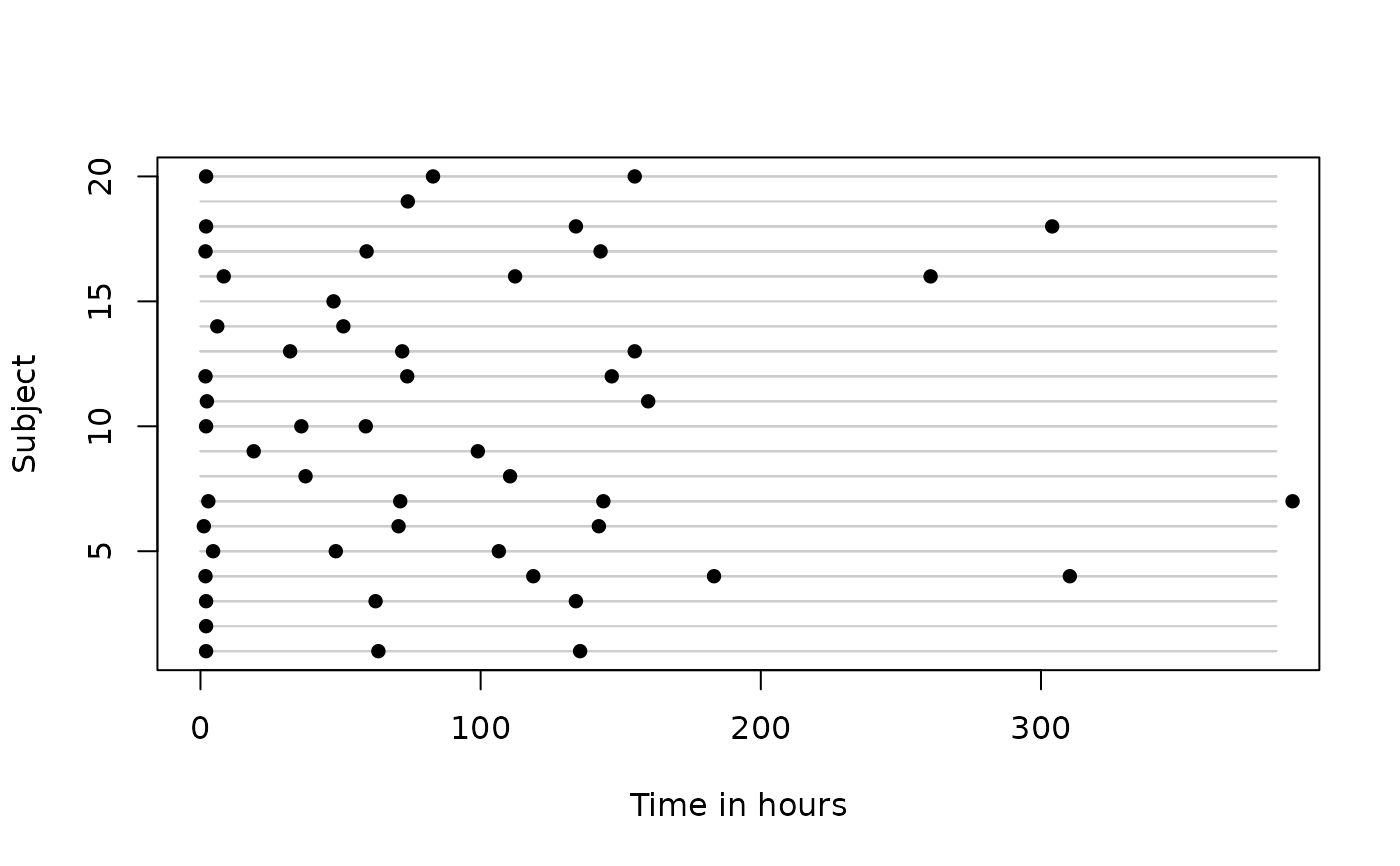
Create an abacus plot Creates an abacus plot, depicting visits per subject over time
abacus.plot.RdCreate an abacus plot Creates an abacus plot, depicting visits per subject over time
Usage
abacus.plot(
  n,
  time,
  id,
  data,
  tmin,
  tmax,
  xlab.abacus = "Time",
  ylab.abacus = "Subject",
  pch.abacus = 16,
  col.abacus = 1
)
Arguments
- n
the number of subjects to randomly sample. Subjects are sampled without replacement and therefore n must be smaller than the total number of subjects in the dataset
- time
character string indicating which column of the data contains the time at which the visit occurred
- id
character string indicating which column of the data identifies subjects
- data
data frame containing the variables in the model
- tmin
the smallest time to include on the x-axis
- tmax
the largest time to include on the x-axis
- xlab.abacus
the label for the x-axis
- ylab.abacus
the label for the y-axis
- pch.abacus
the plotting character for the points on the abacus plot
- col.abacus
the colour of the rails on the abacus plot
Details
This function creates a plot for n randomly sampled individuals from the supplied dataset, with one row per subject and one point per visit. This can be useful for visualising the extent of irregularity in the visit process. For example, with perfect repeated measures data (i.e., no irregularity), the points will line up vertically. With greater irregularity, the points will be randomly scattered over time.
